
Build a 60-30-10 scheme
Pick a mood and an accent. The tool assigns the three colours to real surfaces.
How this tool works
- Each mood carries a fixed dominant and secondary colour with published hex values — five moods, ten colours, all listed in the table below.
- Each accent is a single fixed hex. Five accents, chosen because they work against all five moods rather than only one.
- Visible surface = wall area + floor area. The 60, 30 and 10 percentages are applied to that total to give square-foot targets rather than abstract proportions.
- LRV is computed for the dominant and secondary using the standard luminance formula, and the gap between them is reported with a plain-language reading.
- Paint quantity = wall area × 2 coats ÷ 110 sq ft per litre for the dominant colour.
- The room note is looked up, not generated. Each room type has one published note about where the 30% and the 10% should land in that room.
| Mood | 60% dominant | 30% secondary | Reads as |
|---|---|---|---|
| Warm neutral | Warm oat #F0E9DC | Toasted almond #CFC0AA | Calm, forgiving, the safest choice in a Mumbai flat |
| Cool neutral | Pale cloud #ECEFF1 | Harbour grey #B6BFC6 | Crisp and architectural; needs warm lighting to avoid feeling clinical |
| Earthy | Bone #EFE4D6 | Burnt sienna #B08163 | Warm and grounded; excellent with cane, terracotta and teak |
| Deep | Stone white #DDD8CE | Deep pine #3F4A44 | High contrast and dramatic; needs a well-lit room |
| Coastal | Sea salt #F2F4F2 | Faded denim #9FB6C0 | Light and airy; the most daylight-dependent of the five |
| Accent | Hex | Best against | Where it belongs |
|---|---|---|---|
| Antique brass | #B08D4E | Warm neutral, earthy, deep | Handles, light fittings, mirror frames |
| Terracotta | #C0603C | Warm neutral, earthy, coastal | Cushions, a rug, one painted niche |
| Forest green | #2F5142 | Cool neutral, warm neutral | Upholstery, a single joinery panel |
| Ink navy | #23344A | Coastal, cool neutral | A study wall, cabinetry in a kitchen |
| Matt black | #26262A | All five | Frames, taps, section profiles, hardware |
Design and build under one accountable roof
Worked example — the default living room
Warm neutral with an antique brass accent, in a living room with 450 sq ft of wall and a 160 sq ft floor. The visible surface is 610 sq ft, which gives 366 sq ft of dominant, 183 of secondary and 61 of accent. Warm oat at LRV 91.6% on the walls, toasted almond at LRV 75.9% on the joinery and curtains, brass in the handles, a floor lamp and a mirror frame.
The contrast between dominant and secondary is about 16 LRV points, which the tool reads as subtle — the joinery will sit quietly against the wall rather than standing away from it. That is a legitimate choice and it produces a calm room. If you wanted the joinery to read as a distinct element, switching the mood to earthy drops the secondary to burnt sienna at LRV 53.7% against a bone dominant at 89.9%, widening the gap to over 36 points. Seeing that number before committing is the entire point of the tool.
Where the rule helps and where it does not
It helps most when a room has too many decisions in it. A living room involves wall colour, ceiling, floor, sofa, curtains, joinery, rug, cushions and art, and without a structure each of those gets decided separately and the result is a room that has no position. Forcing everything into three roles — dominant, secondary, accent — resolves most of those decisions before they are made.
Where it does not help is in a room that is genuinely monochrome by intention, or in a space where material rather than colour carries the scheme. A room in oak, linen and lime plaster may have no accent at all and be better for it. The rule is a scaffold for people who need one, and it is normal to leave it behind once the room is working.
One practical note specific to Indian homes: the 10% accent should live in things that can be replaced. Cushions, a rug, art, a pair of lamps. Paint an accent onto a wall and you have committed to it for five years and to a repaint to change it. The households whose rooms still look right after a decade are the ones who kept the permanent 90% quiet.
Every constant on this page comes from Greenbox site records — measured drawings, signed BOQs and completion certificates from projects delivered between 2023 and 2026 — rounded to the figures an estimator would actually write down. We publish them so the arithmetic can be audited rather than trusted. Treat the output as a planning figure: accurate enough to brief a landlord, a bank or a family, and not accurate enough to sign a contract against.
What this tool does not cover
- Screen rendering. Hex values will look different on every display — take the code to a tinting machine rather than matching by eye.
- Existing floor and joinery, which are usually fixed and should be treated as part of the 30% rather than fought.
- Sheen and texture, which change how a colour behaves as much as the pigment does.
- Lighting colour temperature. A 2700K lamp warms every colour in the room and can turn a cool grey green.
- Paint cost and preparation — see the painting cost calculator.
- For a single colour previewed on a wall, use the paint colour visualizer; for broader palettes, the colour palette generator.
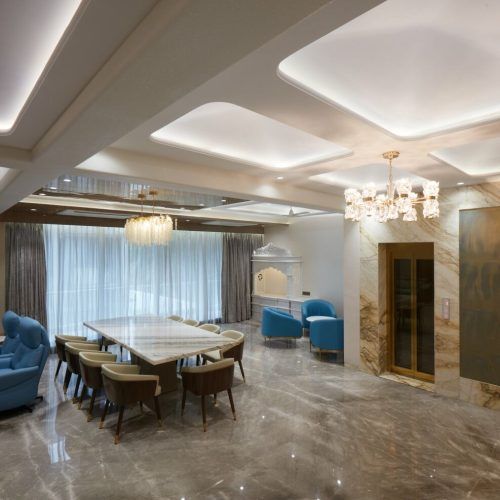
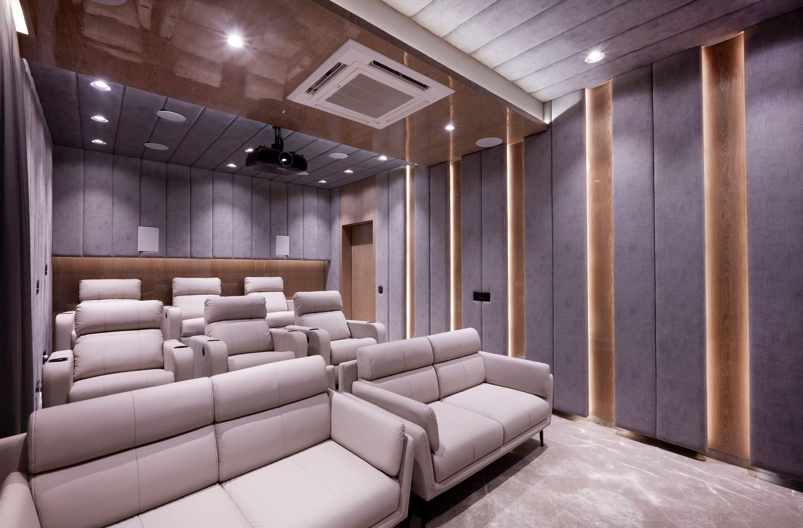
Selected work by Greenbox Design Studio. Tap any image to enlarge.
Frequently asked questions
What is the 60-30-10 rule?+
A way of allocating colour in a room: 60% to a dominant colour on walls and ceiling, 30% to a secondary on joinery, curtains and large upholstery, and 10% to an accent in cushions, art and metalwork. It is a scaffold for making the decisions in the right order, not a law.
How much contrast should there be between the colours?+
At least 30 LRV points between the dominant and the secondary for the pairing to read as deliberate. Between 15 and 30 it reads as tonal, which is a valid calm scheme. Under 15 points most people simply see two shades that do not quite agree.
Where should the accent colour go?+
Into things that can be replaced — cushions, a rug, art, lamps, hardware. Painting the accent onto a wall commits you to it for years. The 10% is the part of a scheme that should be able to change without a contractor.
Does the 60-30-10 rule work in a small flat?+
Yes, and arguably better, because a small room shows a muddled scheme immediately. What changes is the accent: in a room under 120 sq ft, keep the accent to genuinely small objects. A strong accent on a large surface in a small room stops being an accent.
Can I use more than three colours?+
Of course, and most finished rooms do once you count wood tones, metal and textiles. The rule is about hierarchy rather than a hard count — if a fourth colour is clearly subordinate to the other three, it is part of the 10%. The failure mode is four colours all competing for the 30%.