
Generate a room palette
Deterministic presets, not random colours. The same choices always return the same palette.
How this generator works
- The mood selects four base tones — wall, joinery, textile and a grounding dark — from six fixed palettes. These are palettes we have specified and built, not colour-wheel arithmetic.
- The room selects the fifth colour, the accent, and a usage note. A living room gets antique brass; a dining room gets oxblood; a bathroom gets sea glass.
- The daylight setting changes the advice, not the colours — it tells you how far the tones will drift from the chip on your wall.
- Nothing is randomised. Seven rooms × six moods gives forty-two combinations, and each one is the same every time you load the page.
| Palette | Character | Works best in | Avoid in |
|---|---|---|---|
| Lime Wash Calm | Warm off-whites over sage and deep pine | Living rooms, master bedrooms, anywhere small | Rooms with no daylight at all |
| Terracotta Warmth | Bone, terracotta, burnt sienna, dark walnut | Dining, north-facing living rooms | Bright west-facing rooms — it gets hot |
| Salt and Slate | Sea mist, driftwood, slate blue, deep teal | Bedrooms, bathrooms, sea-facing flats | Dim interior rooms — it turns grey |
| Ink and Ochre | Chalk with ochre, russet and ink | Studies, dining rooms, feature walls | Children's rooms — it dates fast at small scale |
| Ivory and Walnut | Ivory, honey walnut, taupe, espresso | Formal living, classic joinery, veneer schemes | Very small rooms — the mid-tones close in |
| Chalk Monochrome | Chalk, pale grey, mid grey, graphite | Home offices, minimal flats, rental fit-outs | Rooms you want to feel warm |
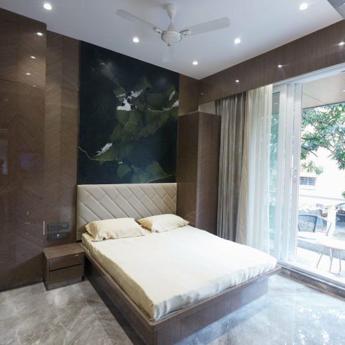
Design and build under one accountable roof
The 60-30-10 rule, and why it is not optional
Sixty per cent of what you see should be the lightest tone: walls, ceiling, the large plain surfaces. Thirty per cent carries the mid-tones: joinery, upholstery, curtains, rugs. Ten per cent is the accent: cushions, art, one metal finish, a single painted door.
The reason it works is not aesthetic doctrine, it is the way a room is actually seen. Your eye needs a large quiet field to rest on before it can enjoy a strong colour. Give it two strong colours at equal weight and it never settles — which is precisely why so many carefully chosen palettes look restless once they are on the wall.
| Proportion | Where it goes | Typical surfaces |
|---|---|---|
| 60% | Lightest tone | Walls, ceiling, large plain joinery faces |
| 30% | Joinery and textile tones | Wardrobe shutters, sofa, curtains, rug, dado |
| 10% | Accent and grounding dark | Cushions, art, one metal finish, a single feature panel |
Mumbai light, and what it does to paint
- West-facing flats take three hours of hard afternoon light. Cool greys go blue and warm whites go yellow. Choose half a shade cooler than the chip suggests.
- North-facing rooms get even, shadowless light all day. This is the best light for a study and the least forgiving for a beige — anything with a yellow base reads dirty.
- Overshadowed low floors in dense suburbs get very little direct sun. Two light tones and warm 3000K lamps; a mid-grey in that light is simply a dark room.
- The monsoon takes four months of the year down to flat grey daylight. Any palette that relies on sunlight to lift it will look bleak from June to September — test a sample in overcast light before committing.
- Salt air near the sea shortens the life of emulsion on external-facing walls. Use a washable acrylic on those, and keep the light tone where it can be touched up.
A colour is not a decision until it is a square metre of paint on your own wall, looked at in the morning, at four in the afternoon and under your own lamps.
Greenbox principal designer
Every constant above comes from Greenbox site records — measured drawings, signed BOQs and completion certificates from projects delivered between 2023 and 2026 — rounded to figures an estimator would actually use. We publish them so you can audit the arithmetic instead of trusting a black box. Treat the output as a planning figure: it is accurate enough to brief a landlord, a bank or a spouse, and not accurate enough to sign a contract against.
What this tool does not cover
- Screen colour is not paint colour. Hex codes on a backlit display are a reference for a tinting machine, not a match. Expect a visible shift.
- Sheen changes perceived colour: the same tint in matt, eggshell and satin reads as three different colours. Specify the sheen as well as the shade.
- Undertones in existing flooring, stone and veneer will fight or flatter a palette, and none of that is visible to this tool.
- Brand shade cards (Asian Paints, Berger, Dulux, Nerolac) do not map one-to-one onto hex values; your painter will tint to the nearest match.
- Lighting colour temperature is not modelled beyond the daylight note. A 4000K downlight will kill a warm palette regardless of how good the colours are.
- For the cost of painting, use the painting cost calculator and the paint quantity calculator.
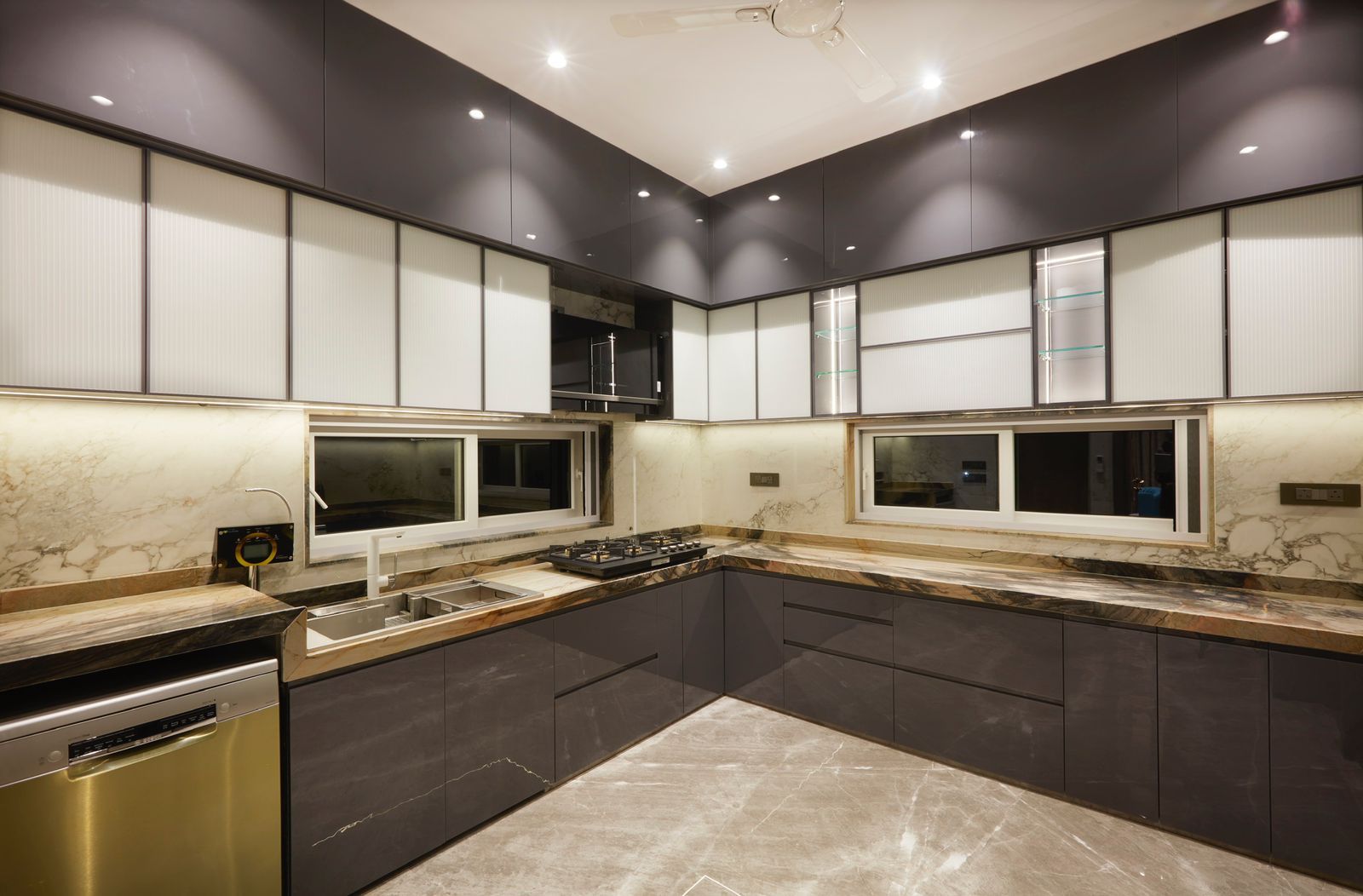
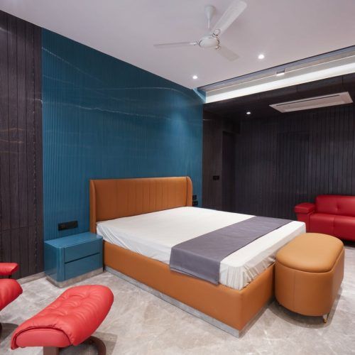
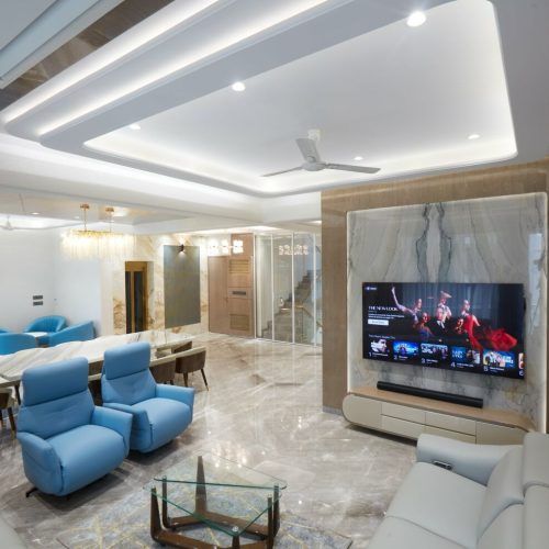
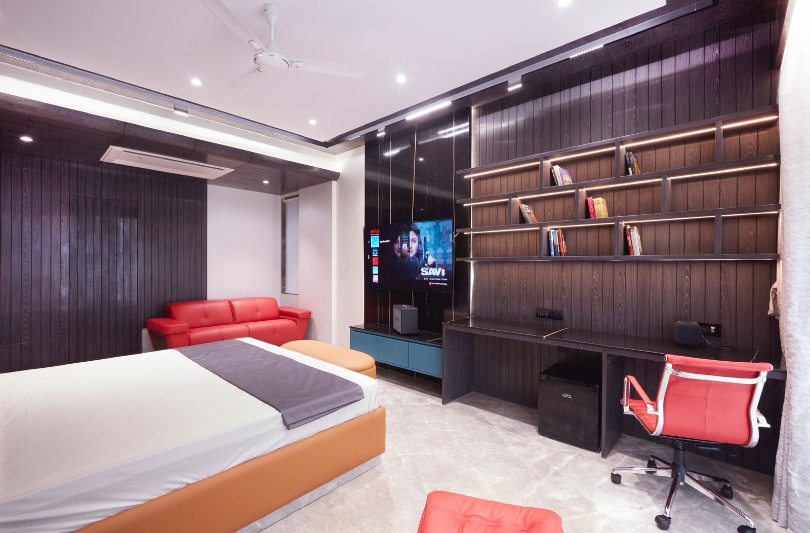
Selected work by Greenbox Design Studio. Tap any image to enlarge.
Frequently asked questions
How many colours should an interior palette have?+
Four base tones and one accent is the practical maximum for a single room. Below three it looks unresolved; above five it becomes hard to distribute at 60-30-10 without something feeling arbitrary. Carry two of the five through the whole home so the flat reads as one place.
What is the 60-30-10 rule in interior design?+
Sixty per cent of the visible surface in the dominant light tone, thirty per cent across secondary tones in joinery and textiles, ten per cent accent. It works because the eye needs a large quiet field before it can enjoy a strong colour, and it is the fastest fix for a room that feels restless.
Do these palettes work with existing flooring?+
Usually, but the floor undertone decides which. A yellow-toned wooden floor fights the cool palettes and flatters Ivory and Walnut or Terracotta Warmth. Grey vitrified tile does the reverse. Photograph your floor in daylight and hold the sample against it before you commit.
Should the ceiling be the same colour as the walls?+
In a standard 9 to 10 ft Mumbai ceiling, yes — use the same light tone, or the same tint at 50% strength. A contrasting white ceiling cuts the room's apparent height by drawing a hard line at the cornice. Reserve a coloured ceiling for rooms over 11 ft.
How do I test a colour before painting the whole room?+
Get a litre tinted and paint a full 1 × 1 m patch on the actual wall, ideally two patches on walls facing different directions. Look at it in morning light, at four in the afternoon and under your own lamps at night. A2 sample cards held up to the wall mislead almost every time.