
What the numbers actually refer to
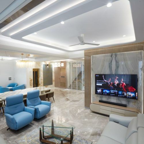
The most common misapplication is treating 60-30-10 as a recipe for three paint colours. It is not. It describes how much of a room's visible surface each tone should occupy once everything is in place — floor, walls, ceiling, joinery, curtains, upholstery, rug and objects. A room painted in one colour with white joinery and a grey sofa has already used its 60 and its 30 before a single cushion arrives.
The reason it works is not aesthetic mysticism. A room with three colours at roughly equal weight gives the eye no place to rest and no hierarchy to read; the eye keeps searching. A clear dominant with a clear subordinate and a small bright signal is legible in a fraction of a second, which is why it feels calm.
| Share | What it usually is | Typical surface area in a 180 sq ft living room | Decision owner |
|---|---|---|---|
| 60% dominant | Walls, ceiling, floor, large joinery | About 620–700 sq ft of visible surface | Paint and flooring choice |
| 30% secondary | Sofa, curtains, rug, feature wall, TV unit | About 300–350 sq ft | Furniture and soft furnishing |
| 10% accent | Cushions, art, lamps, metal, plants | About 100–120 sq ft | Styling, changed seasonally |
Starting from a floor you cannot change
Most Mumbai interiors begin with a floor that is already laid — vitrified tile in a builder-finished flat, or Kota, marble or mosaic in an older one. That floor is 160–200 sq ft of continuous surface in a living room, which is roughly a quarter to a third of the visible area, and no amount of wall colour outvotes it. Any scheme drawn without the floor in front of you is a scheme for a different room.
- Identify the floor's undertone first. Grey vitrified tile is often faintly blue or faintly beige, and the two pull a scheme in opposite directions. Hold a sheet of pure white paper against it; the cast becomes obvious.
- Decide whether the floor is part of the 60 or the 30. A pale floor merges with pale walls into one dominant field. A dark floor stands apart and becomes the secondary, which means the walls carry 60 on their own.
- Choose the dominant to agree with the floor's undertone, not to fight it. Warm beige walls over a cool grey floor is the commonest unforced error in builder flats.
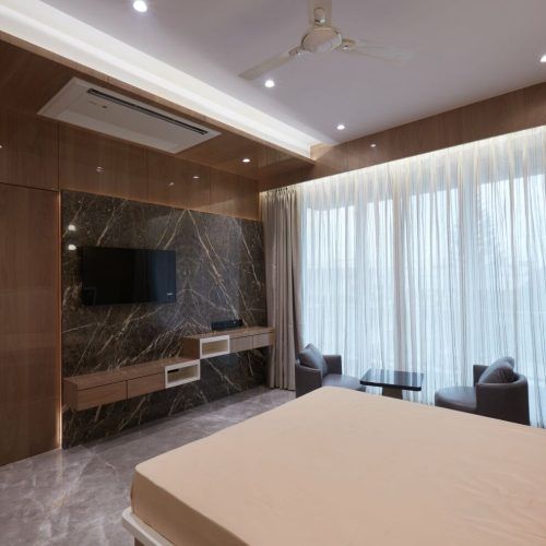
- Give the 30 to joinery, because joinery is permanent. Wardrobes and the TV unit are the largest single-colour objects you will buy, and they cannot be changed seasonally.
- Keep the 10 in the movable layer. Cushions, art, a lamp, a throw, one painted door. That is the part of the scheme you are allowed to get wrong cheaply.
Design and build under one accountable roof
Where the accent goes
An accent used once is a mistake; used three times it is a decision. The rule of thumb we use is a triangle — the accent colour should appear at three points spread across the room so the eye travels between them. In a living room that might be a pair of cushions, a framed print on the opposite wall and a ceramic object on the console. Ten per cent is small enough that a single hit disappears and large enough that three hits register.
- Metal counts as an accent. Brass, black, chrome and antique copper each behave like a colour. Pick one and keep it consistent across handles, light fittings, taps and frames.
- Plants are the cheapest accent in an Indian home and they read as green even in a scheme with no green in it. Budget for them in the plan, not as an afterthought.
- Art is the only accent that can be changed in ten minutes. If you are unsure of a colour direction, buy the sofa neutral and commit through art.
- Avoid accenting with a warm and a cool version of the same colour. Two reds — one orange-leaning, one blue-leaning — in the same room read as a mismatch, not as a palette.
The three cases where the rule fails
A rule that is applied without exception is a rule that has stopped being useful. Three kinds of room are made worse by 60-30-10.
| Scheme | Why the rule fails | What to use instead |
|---|---|---|
| Monochrome / tonal | Only one hue exists; the split is meaningless | Vary value and texture: 60% mid, 30% light, 10% dark |
| Maximalist / pattern-led | Pattern carries five colours at once | Repeat one colour from the pattern in three places; let the rest be busy |
| Heritage and traditional Indian | Carved wood, brass and stone are materials, not colours | Balance material weight, not hue: 60% calm surface, 40% craft |
| Very small rooms, under 90 sq ft | Three colours fragment a small space | Two colours plus one metal, 75-20-5 |
Testing before committing
Paint an A2-sized patch of each candidate colour directly on the wall, not on a card, and look at it at three times of day: mid-morning, late afternoon and at night under your intended bulb temperature. Mumbai's west light between 4 and 6 pm is warm and strong, and it is the hour that turns an approved grey into a mauve. Do this before ordering laminate, because laminate lead times are two to three weeks and a repaint is a day.
Sixty, thirty and ten are the proportions. The skill is deciding which surfaces belong to which number.
Greenbox principal designer
A note on how the rule travels between rooms. A flat where every room follows 60-30-10 independently, with a different trio each time, reads as a series of unrelated hotel rooms. The version that works in a home keeps the dominant 60 broadly constant throughout — usually one wall tone and one floor — and changes only the secondary and accent from room to room. That way the corridor between the living room and the bedroom is not a border crossing, and the flat reads as one dwelling with rooms that have moods rather than as six schemes stacked next to each other.
And one about intensity. The 10% accent does not have to be a bright colour; it has to be the most distinct thing in the room. In a pale scheme, a deep charcoal is an accent. In a dark scheme, a pale bone is. What decides whether an accent works is its distance from the other two tones in value, not its saturation — which is why photographing your room in black and white is such a useful test. If the three tones collapse into one grey in the monochrome photograph, the scheme has no hierarchy, whatever the colours are.
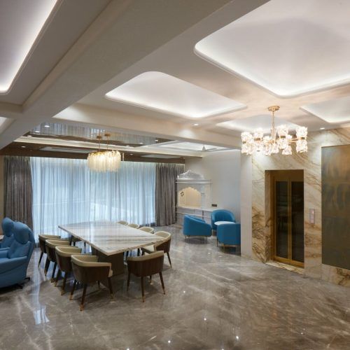
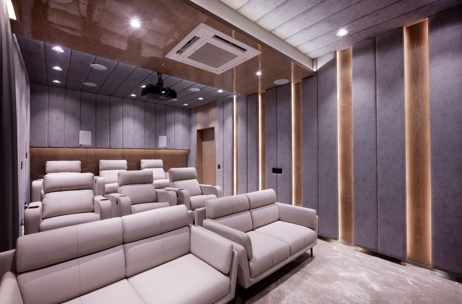
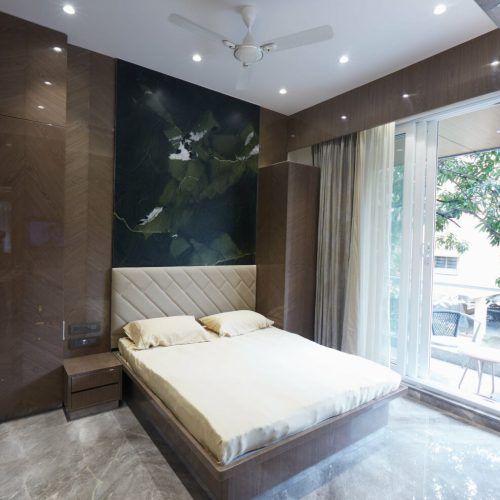
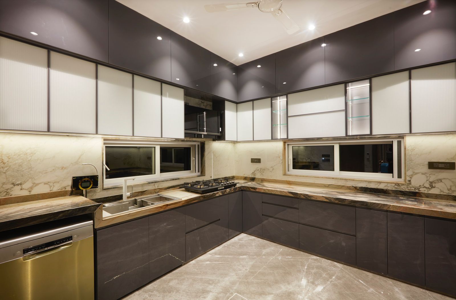
Selected work by Greenbox Design Studio. Tap any image to enlarge.
Frequently asked questions
Does the 60-30-10 rule include the floor?+
Yes. It refers to all visible surface, and in a Mumbai flat the floor is 25–35% of what you see in a living room. Whether it sits inside the 60 or acts as the 30 depends on how close in value it is to the walls. Pale floor with pale walls: one dominant field. Dark floor: the floor becomes the secondary.
Can I use more than three colours?+
Yes, provided the proportions still resolve into a dominant, a secondary and an accent. Two closely related neutrals can share the 60, and two accent tones can share the 10 if they sit next to each other on the colour wheel. What breaks a room is three or four colours at similar weight with no hierarchy between them.
What is the 10% accent in a neutral room?+
Usually metal, wood tone or greenery. In an all-neutral scheme the accent job is done by contrast of value or material rather than hue — a black metal frame, a dark walnut stool, a group of plants. It still needs to appear in three places to register as intentional.
Does the rule apply to bedrooms?+
It applies, but with a cooler accent and a lower contrast. Bedrooms benefit from a tighter value range because high contrast is stimulating; keep the 10% accent to textiles and a bedside lamp, and let the headboard wall carry the 30. See how to choose paint colours room by room.
How do I apply it with existing furniture?+
Work backwards. Identify what you are keeping, measure its visible surface, and assign it to the 60 or the 30 accordingly. A large brown sofa you are not replacing is your secondary, and the wall colour must then be chosen to sit with it. Most real projects are this exercise rather than a blank sheet.