Creating Welcoming Entrances: Crafting a Memorable First Impression
The entrance of a hotel sets the tone for a guest’s stay. To create an exceptional and memorable first impression, attention to detail is key. Here are some tips to craft welcoming entrances:
Consider the Layout: The layout of the entrance should be intuitive and easy for guests to navigate. Clear signage, well-placed furniture, and open spaces can make guests feel comfortable and welcome.
Lighting Matters: Proper lighting can enhance the ambience of an entrance area. Soft, warm lighting creates a cozy atmosphere while brighter lights can highlight certain features or artwork.
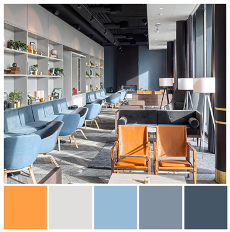
Color Psychology: Different colors evoke different emotions. For example, blue can be calming, while red can be stimulating. Understand the psychological effects of colors to align them with the intended atmosphere of the space.
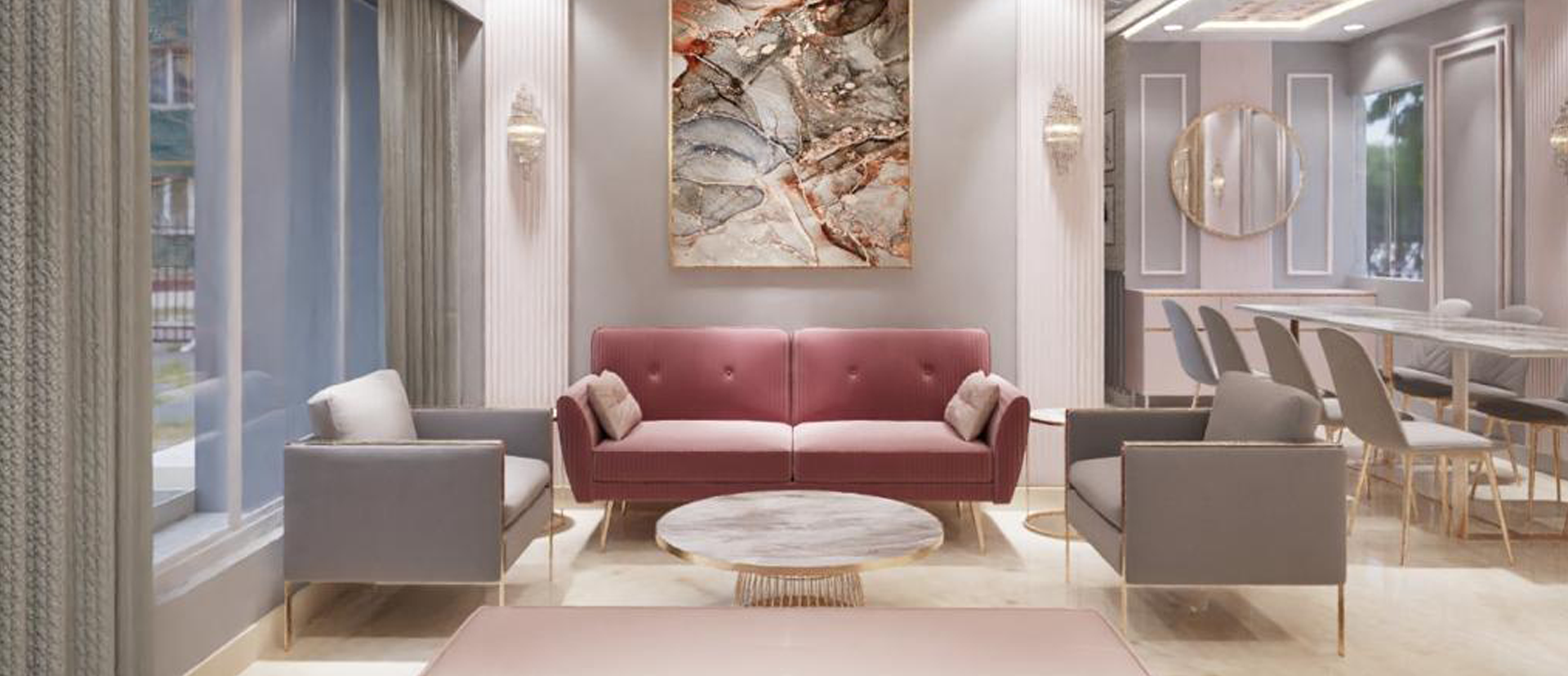
Entrance and Waiting Areas
Inviting Warm Colors: Shades like soft yellows or warm reds can create a welcoming and energetic environment, encouraging guests to feel comfortable while waiting.
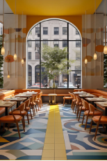
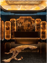
Dining Spaces:Warm Reds and Oranges: These colors are known to stimulate appetite and can enhance the overall dining experience by creating a lively and energetic environment.
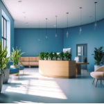
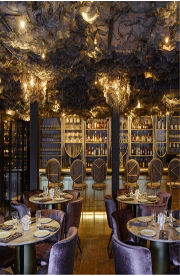
Cool Blues and Greens: If you want a more relaxed atmosphere, consider using cooler shades to create a soothing and pleasant dining experience.
Balance and Contrast: Use a mix of colors to create balance and avoid overwhelming guests. Combining neutral tones with vibrant accents can help achieve a well-rounded and inviting environment.
Red, orange, and yellow: warm tones These vibrant colors are known to increase appetite and stimulate social interaction among diners.The energetic nature of these warm tones can create a lively and dynamic atmosphere in your restaurant.Fast-casual eateries and vibrant dining concepts can benefit from the use of these colors to enhance the overall dining experience.
Blue, green, and purple: cool tones These cool tones have a calming effect on diners, promoting a sense of tranquility and relaxation.The use of blue, green, and purple can enhance the perception of freshness and healthiness in the dining experience.
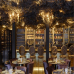
Restaurants that focus on exquisite dining or wellness concepts can benefit from incorporating these colors to create a soothing and rejuvenating ambiance.
White, beige, grey: neutrals Neutral colors like white, beige, and grey help create a clean and sophisticated atmosphere in a restaurant.By using these neutral tones, you can allow other design elements and food presentation to take center stage and be the main attraction.
Neutrals are often used as a foundational color scheme to balance and complement other colors, creating a harmonious and visually pleasing environment.